Art 1133 | Design II
Design II is a six hours studio course, a continued study of the fundamental elements and principles of design with an emphasis on the theory and application of color.
Below are descriptions of some of the assignments in the course with student work examples.
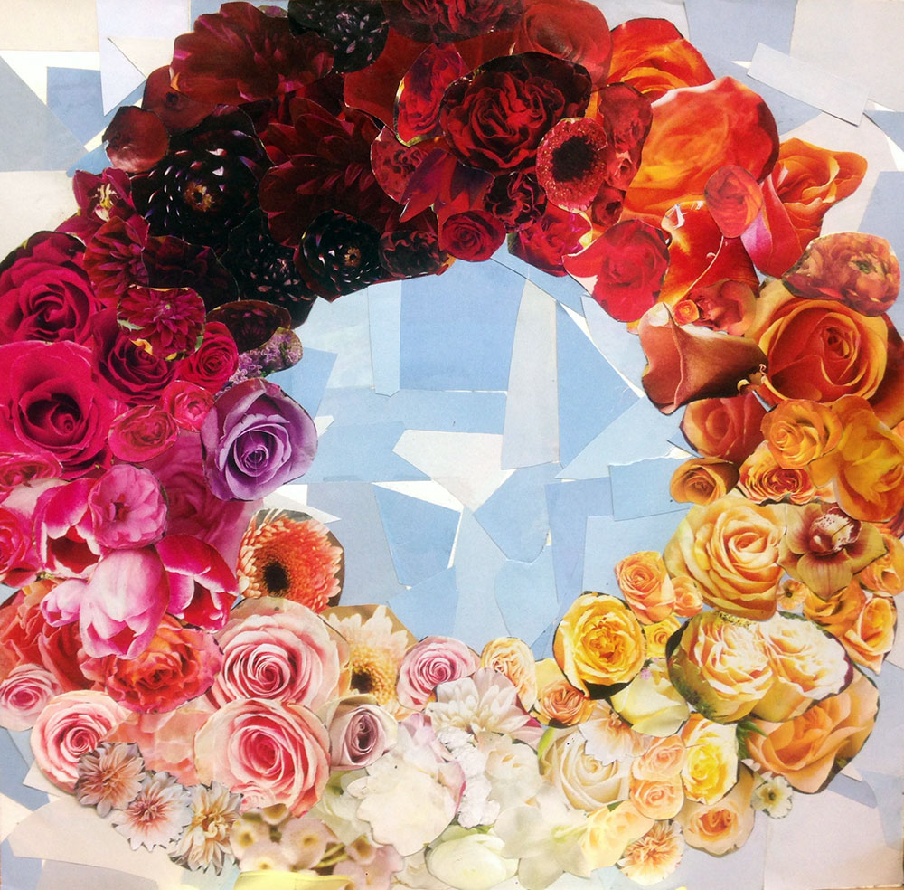
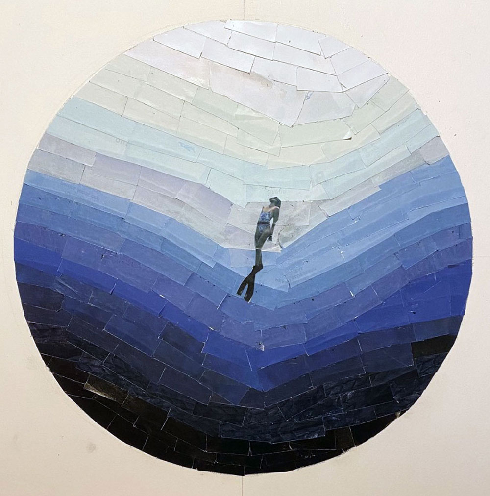
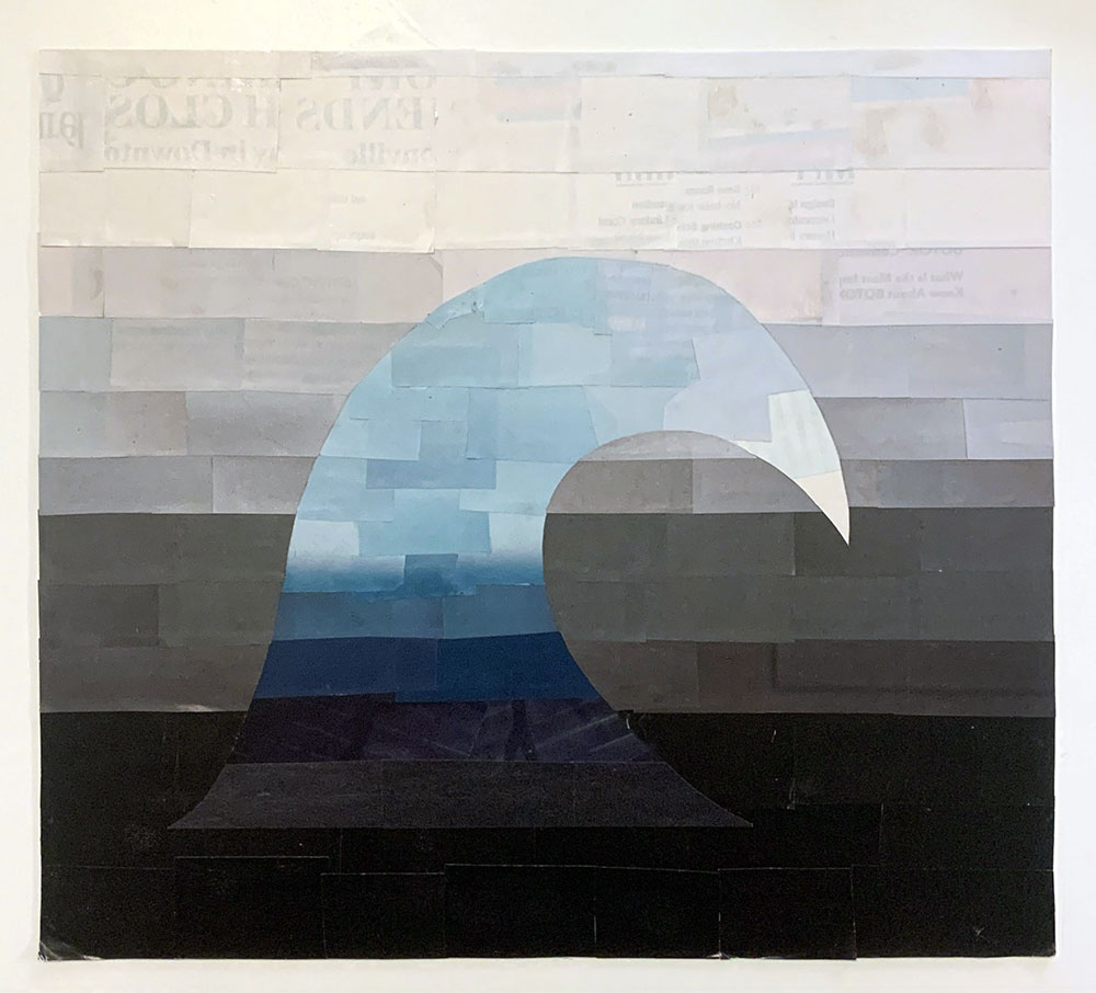
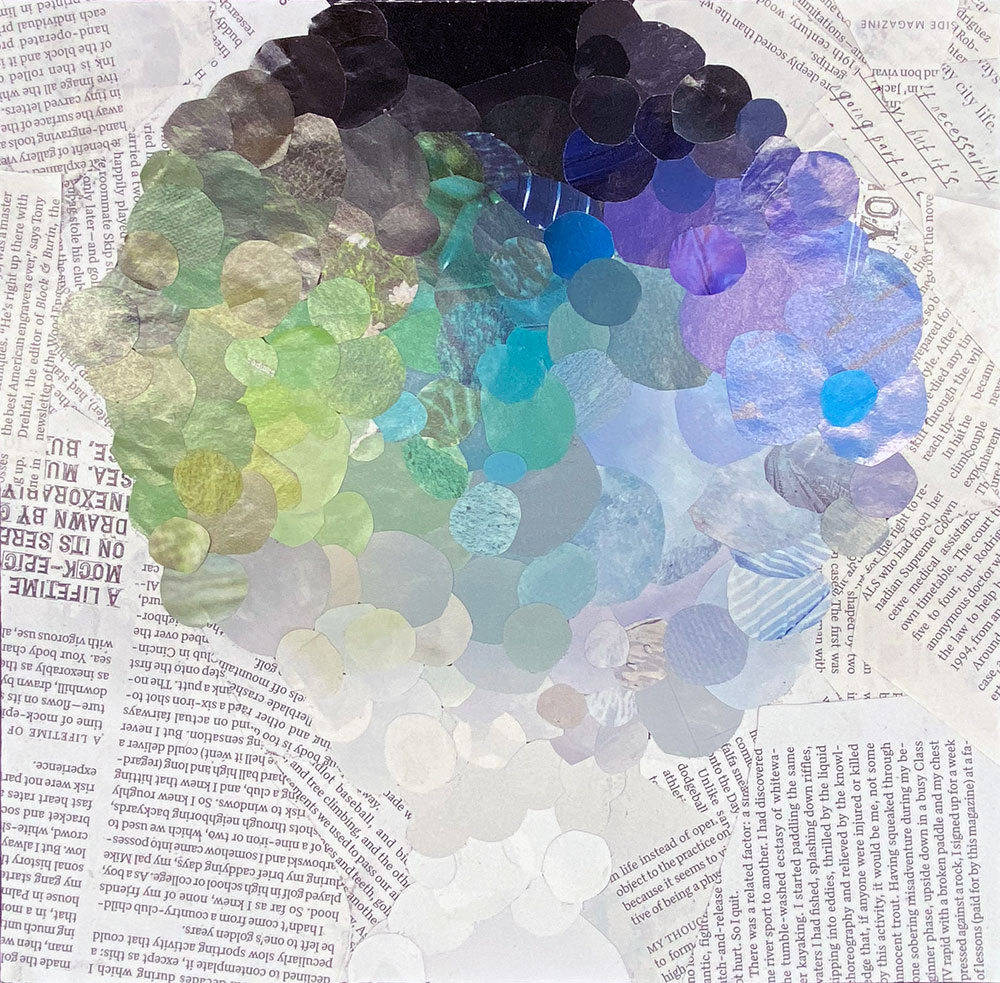
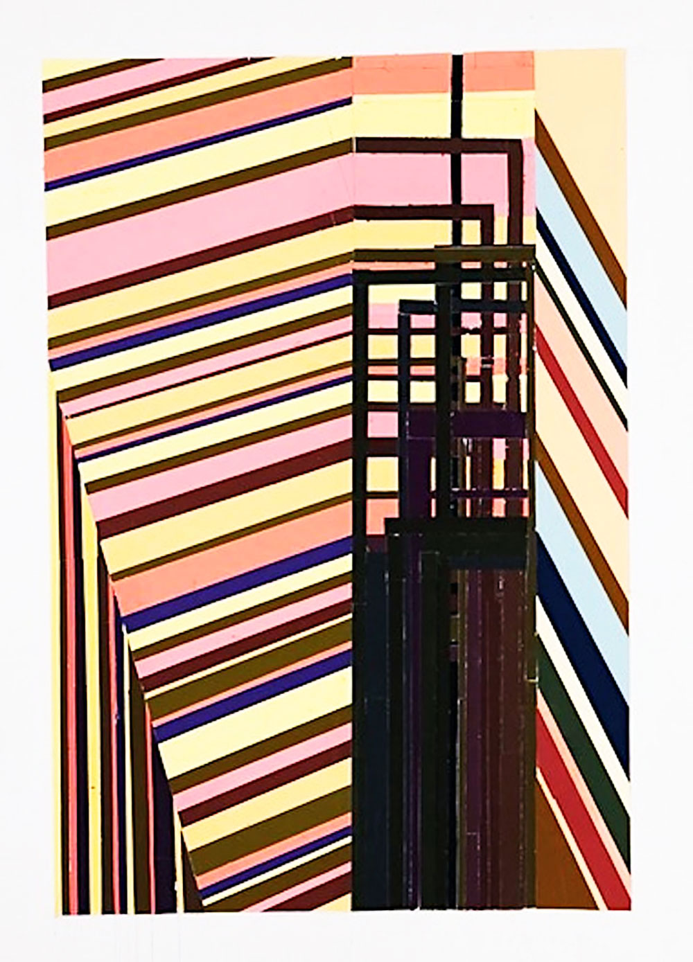
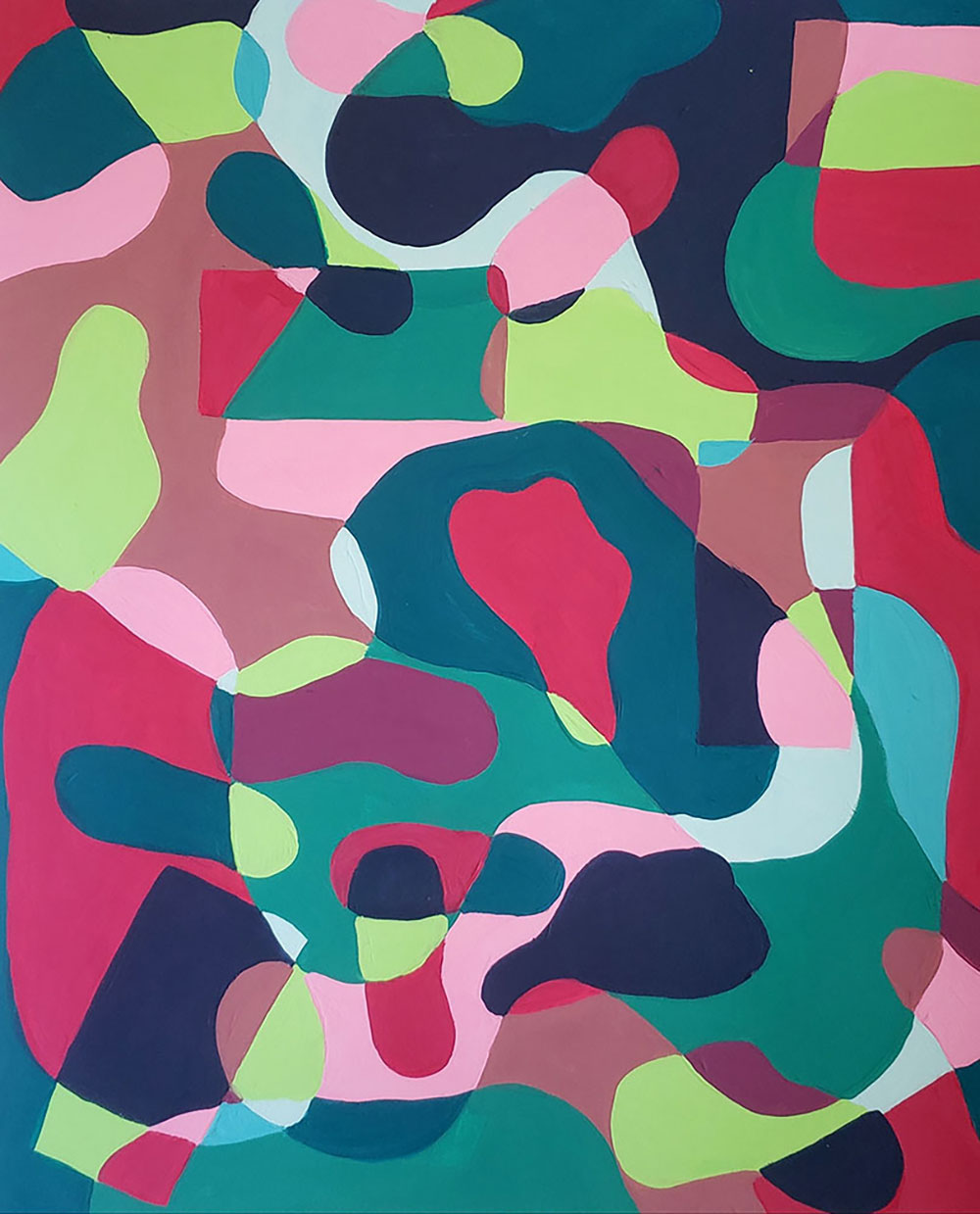
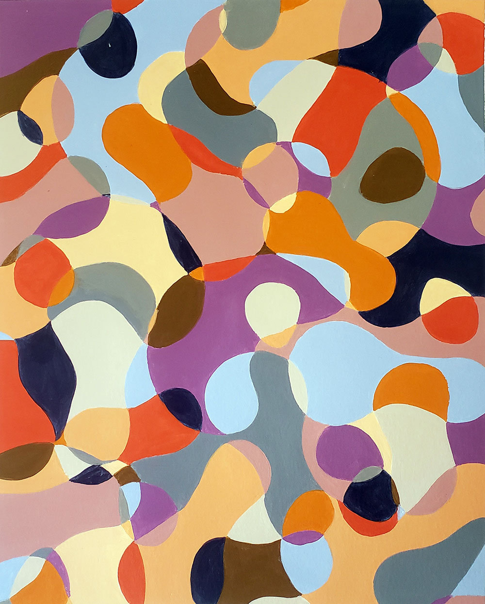
Gradation Collage Project
PROJECT: Through a process of collage, students will develop a piece that is largely based around the use of gradation. Areas of gradation within each collage will aim to address value, saturation, and use of at least one hue in the following ways. Gradations should aim to express:
- A full range of VALUE (absolute black to absolute white)
- A full range of SATURATION (from 0% - 100% saturated use of color)
- Use of at least one HUE family (red, blue, green yellow, etc.).
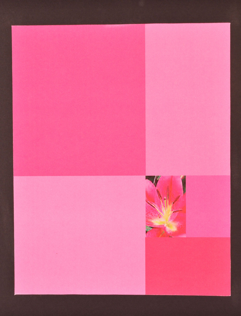
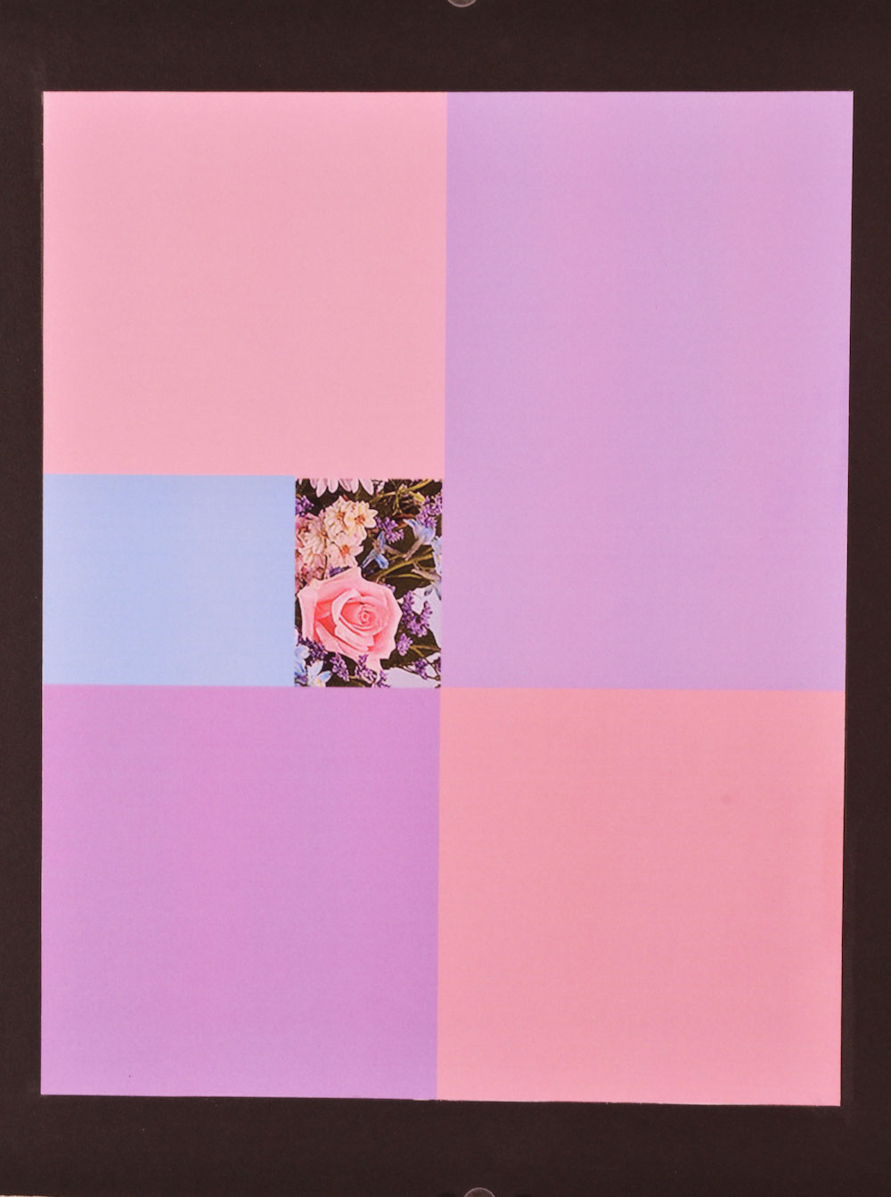
Translation of Motifs & Improvising with Color
MATERIALS – One chosen black and white photograph, illustration board, black construction paper, Color Aid paper, X-ACTO knives, ruler, rubber cement
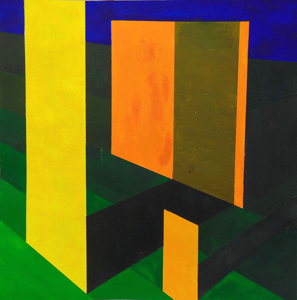
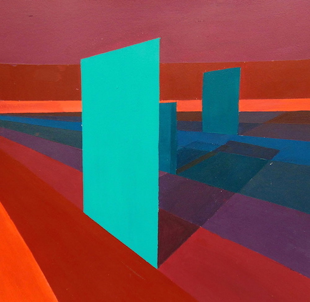
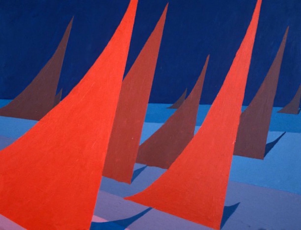
Spatiality Through Color
This project serves as an inquiry into the kind of color use traditionally used to express spatiality in 2D representation. The kind of color use we will use will work hand in hand with 2D representational drawing concepts to convincingly create the effects of atmosphere and spatiality; those concepts being linear perspective, atmospheric perspective and diminution (see definitions).
In our experiences of the world around us, colors of shadows often contrast in terms of value, hue, saturation and temperature with the light that create them. In this way, we can generally assume that a highly-saturated warm light would create a less saturated cool shadow. Notice in the example (below) how the light red warmth of figurative elements in the foreground contrast with the darker cool blue qualities of elements in the background. This contrast helps achieve a feeling of spatiality, particularly when enforced by ideas of linear perspective and diminution.
PROJECT: On a piece of illustration board, establish a horizon line and areas from the foreground to background that represent diminution (start by representing these areas with contour at first). Create a figurative element that you will use repetitively as diminishing in space on a ground moving towards the horizon line. Develop a lighting scheme that addresses the ideas of natural color and aim to address a direction of light (ask yourself where is the light coming from). To establish a convincing sense of light, it may help to refer back to the complementary color-value scales (previous lesson and exercise dealing with use of contrast regarding value and color compliments; see examples below).
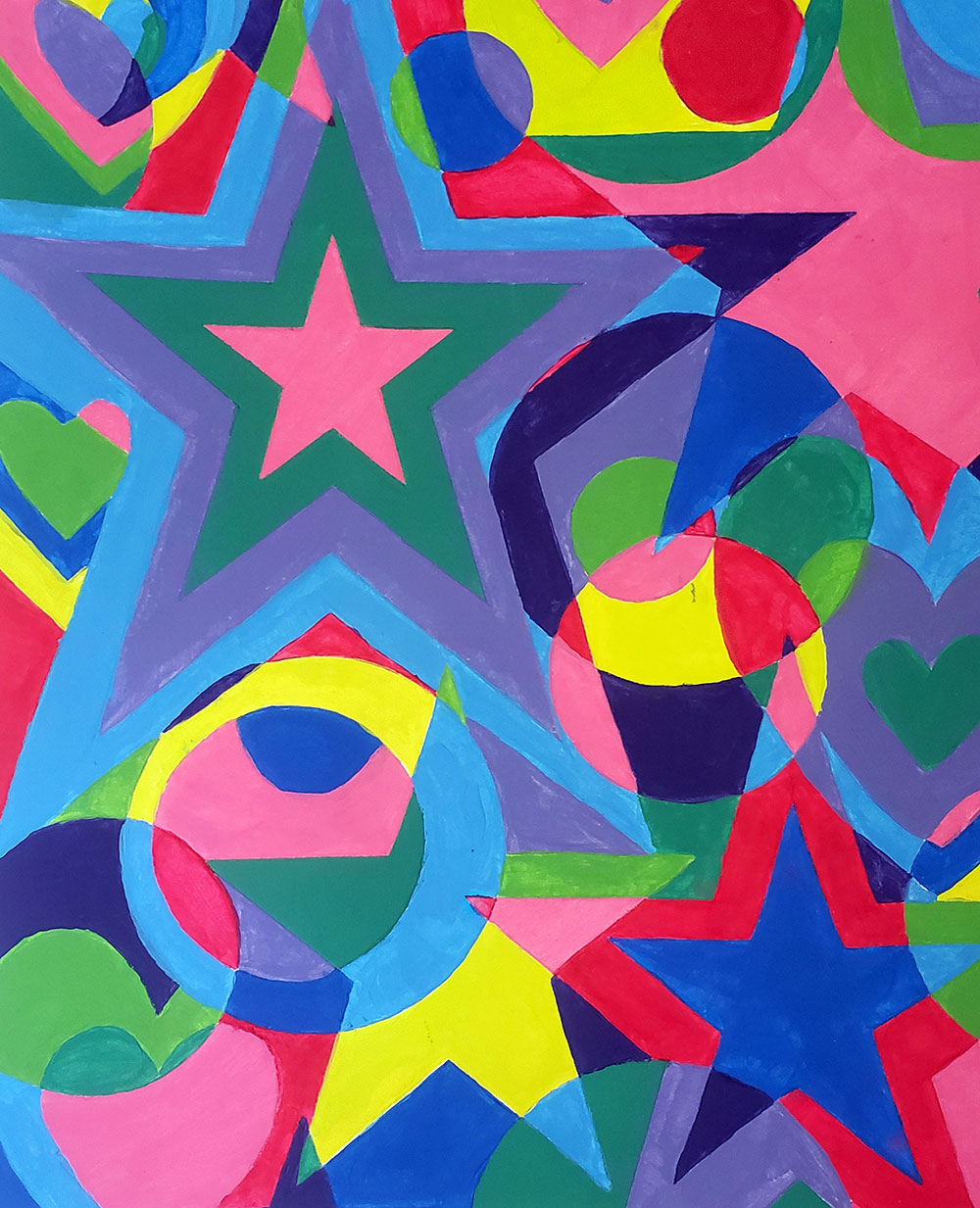
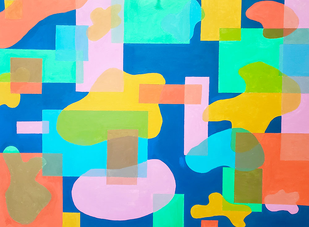
Color Harmony
The goal of this study is for the student to use a unique invented shape as a basis for a composition using figure/ground ambiguity, scale contrast, and overlapping shapes. A complementary or split commentary color scheme will be explored.
- Create 1-3 invented shapes that are not overly complex. The shapes can be curvilinear, rectilinear, or organic.
- Photocopy or draw your shape(s) in multiple sizes on Bristol board. Cut them out and use them as stencils for your composition.
- Cut your paper to the format required below and begin your composition. Overlap is required. Feel free to tilt or flip your stencils to create a more dynamic composition. The composition can be filled entirely with positive shapes if this doesn’t become too complex. Feel free to erase unnecessary lines to simplify the composition.
- You will use a complementary or split color scheme plus white to create all the colors you will need for this assignment. Your starting complementary or split complementary colors can vary in saturation and value.
- Mix these starting colors to develop a 12-color inventory. This color inventory should be broad in saturation and value levels. You will use this inventory as a guide for color placement.
- Figure out a color placement plan on your composition. At least 6 colors should be used. You can also make a photocopy of your current composition and test out color placement that way. You want the composition to feel balanced with color proportions that are harmonious.
- Mix all the colors you will be using and save them in a storage container.
- Fill in your composition leaving no white areas.
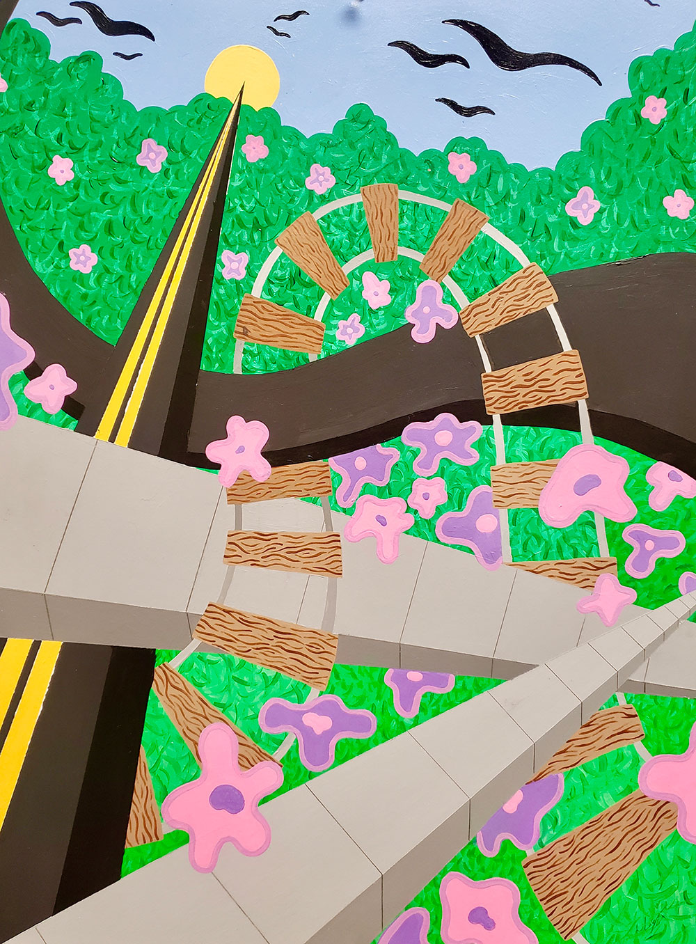
Dualities: Creating Visual Tension
Project Description: You will create visual tension in a single composition based on your chosen duality. The composition must be abstract, meaning that you can use invented or pre-existing shapes. Avoid representation.
Your final piece will include the following:
- 1 color palette per word
- A sense of space
- Area(s) of emphasis
- Consider how rhythm, movement, balance, harmony/discord, texture, and shape affect the content of your
- work
Materials:
- Bristol paper least 15”X20” (does not have to be rectangular in format)
- Acrylic Paint + Paint supplies
- Color Wheel for reference
- Sketchbook
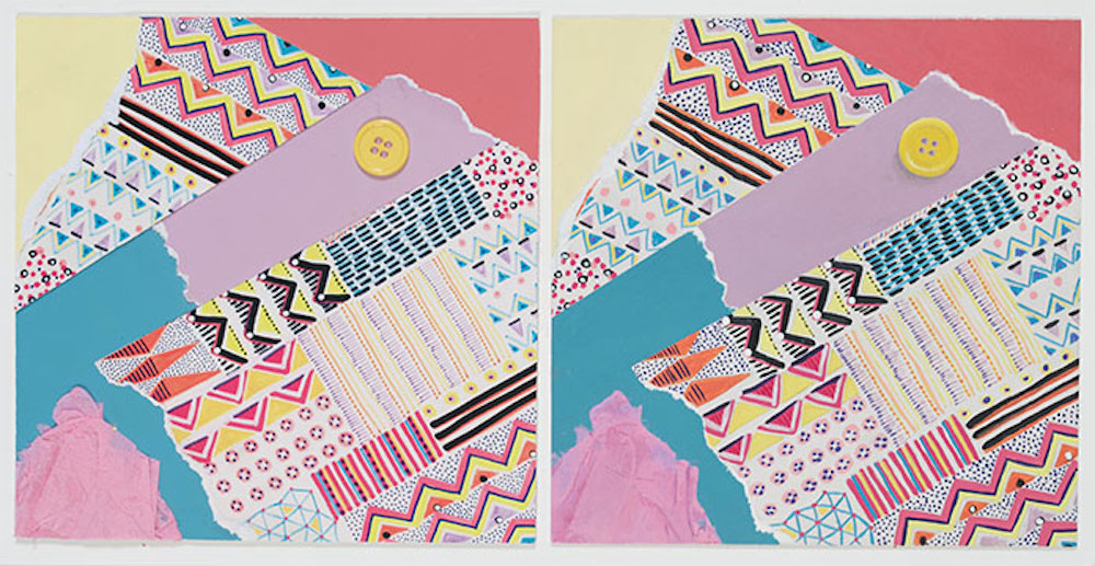
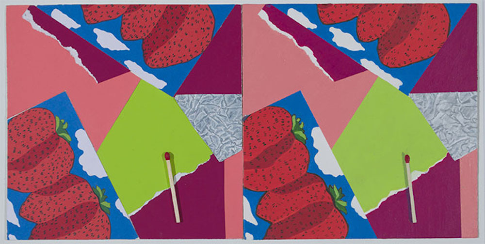
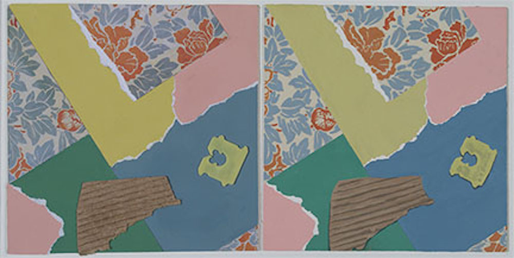
Collage Mimic
Using Color Aid Paper, design a 4 x 4” collage which includes an image, one texture, and one small object. Keep the design as flat as possible. Try to use thin textured materials like sandpaper, ribbon, etc. Use illustration board as the support and cover the entire surface. Next, paint a facsimile of the collage onto a second piece of 4 x 4” illustration board. Be critical of color, texture, shape, and image. Try to mimic everything precisely. Do the best you can when mixing colors. Be aware that acrylic colors may change as they dry (colors usually darken in value when they dry). Some hues may be difficult or impossible to match.
Color Collage Series
Cut out a square or rectangular section from each image that is no larger than 1 .” x 1 .” (it may be smaller). Next, cut 13 sheets of white construction paper in half. Mix, match, and paint 5 colors from each image on five sheets of construction paper. The five sheets of paper within each color usage should all be different. Start with monochromatic. Using the photographic image and between 5-7 rectangular or square pieces of painted paper, create a 7 x 9” collage. Do not use any irregular shapes. Only use squares or rectangles. Consider color placement and proportion and try to create a sense of balance through color placement. Glue the image and painted papers down with rubber cement on 9 x 11” illustration board.
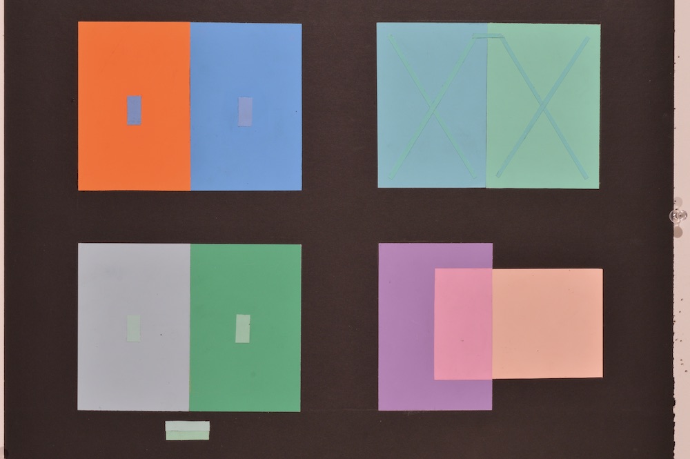
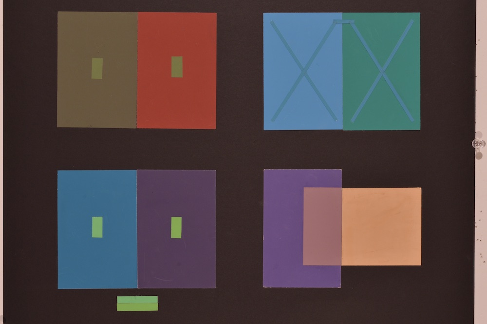
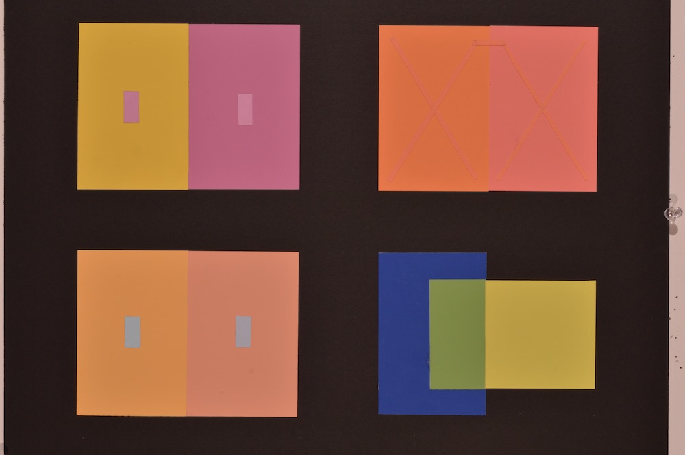
Color Interaction Series
1. Select one color and cut two ó x .’ pieces of Color Aid Paper. Place the two rectangles on different color backgrounds (full sheet) making the rectangles look as different as possible.
2. Select two colors that are similar but different. Cut a ó” x .” rectangle from each color. Place the rectangles on different color backgrounds trying to make the rectangles appear to be the same color.
3. Select two different colors of Color Aid Paper. Lay one sheet on top (perpendicular) of the second sheet. Pretend that the top paper is transparent. Select a third color paper that would result as the visual mixture between the top and bottom sheets of paper.
4. Select one sheet of Color Aid Paper. Cut 1/8’ strips 4” long. Make two X’s from four strips. Place the X’s on separate backgrounds. You must use colors that result in the following: when the X is on the left background color, it looks like the right background and when the X is on the right background color, it looks like the left background.